The label on a wine bottle is a fundamental element in reaching the customer, as it is a key piece in building brand perception, what is commonly known as wine branding. At WINERYON, we are fully aware of the value our labels have when it comes to attracting customer attention, which is why we pay special attention to every single detail that forms part of them.
Behind every label there is meticulous work where typography, colors, textures, sizes, finishes, and information are masterfully combined to deliver a result worthy of the wine it represents. This discipline, closely linked to psychology, is known as “wine branding” and is one of the core tasks developed by wine producers.
How does a wine label influence consumer choice?
A wine bottle label is a decisive visual factor in purchasing decisions. Many studies even consider it to be as important as price. The label acts as the main visual and technical communication tool between the winery and the consumer, justifying the purchase, guiding taste expectations, and conveying the personality of the product.
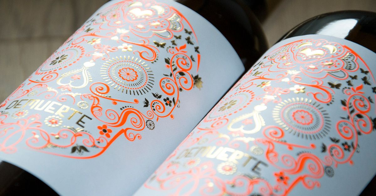
In this regard, the labels of our DEMUERTE wine collection feature an attractive and elegant aesthetic that communicates the value and exclusivity of each variety.
Why is a wine label important in consumer decision-making?
A wine label communicates the value and exclusivity of the wine even before the bottle is opened. It is a vital visual attraction element. An evocative design helps customers emotionally connect with the winery behind the product.
Additionally, the label is a key source of information. Through it, consumers know exactly what they are about to drink and whether it matches their preferences. Labels contain essential details such as origin, grape variety, vintage year, alcohol content, volume, sulfites, and other allergens.
Finally, labels are also the space where producers can showcase relevant aspects related to the wine, including awards, medals, certifications, and recognitions.
What do DEMUERTE wine labels communicate?
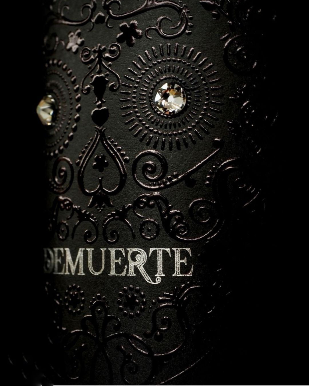
The DEMUERTE labels were developed from a bold, vibrant, and provocative concept. Their central design features a skull silhouette inspired by the Mexican Catrina. In our case, it is not used as a funerary symbol, but as a tribute to celebrating life and enjoyment — the perfect metaphor for drinking a glass of our wines.
From a visual and conceptual standpoint, our labels communicate:
- Wine personality: Skull colors and typography change depending on the wine style, guiding consumers and reflecting the character of each variety.
- Innovation and fun: Some labels, such as DEMUERTE CLASSIC, are printed with special glow-in-the-dark inks, transmitting a modern, disruptive, and festive spirit.
- Character and intensity: Our labels move away from traditional wine aesthetics and suggest that the wine is so intense and captivating that it deserves the expression: “it’s to die for”.
If you want to enjoy a quality wine starting from its label, discover our DEMUERTE wines. They will captivate you at first sight.
